8 Proven Ways to Skyrocket Your Website’s Conversion Rate
Try these 8 conversion rate optimization techniques to boost conversions on your website.

Nothing is worse than having a great product or service, but not being able to get anybody on board.
You know you’ve got something special, yet you’re having an impossible time convincing anyone else to buy in.
You thought that if you just built it, they would come, right? Well, you built it, but the rest didn’t really work out too well.
So now what?
Good news. You don’t have to remain stuck with a terrible conversion rate. With just a few tweaks, you can start seeing immediate improvements. Suddenly you’ll go from being a door-to-door evangelist, with no conversions, to being a cult leader (of sorts), where you can’t keep people away.
Here are 8 ways to increase the conversion rate on your website.
1. A/B test the heck out of everything
A/B testing is simply creating an “A version” of a page and a “B version” of a page and then seeing which one creates more conversions. By iterating this multiple times, you can keep narrowing things down until you have a massively high-converting page.
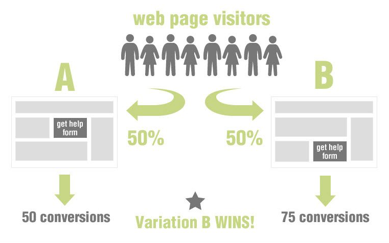
Image Credit: Addiction Marketing
What should you be A/B testing? Everything.
Even small, seemingly insignificant changes can generate surprising bumps in your overall conversion rate. Tinker with:
- The headline. Incorporate different words playing on different emotions. Try a positive headline, a negative headline, and a headline making big promises.
- The page layout. Move key sections around to see which layout performs best. Try a single “Buy” button then multiple ones. Include more images, bigger images, less text, more bullet points. As you work through these various permutations, keep narrowing it down until you determine which layout crushes it.
- Your offer. Don’t be afraid to mess around with your price, discounts, and bonuses. Add in additional bonuses and watch for jumps in conversions.
- The “Buy” Buttons. Change up the language on your call-to-action buttons. Try using direct language like, “Buy now”, as well as more conversational statements like, “Yes, I’m in!”
These are just a few of the things you can test. Think of A/B testing like a scientific experiment, and yourself as the mad scientist.
Feeling skeptical about whether this can really make a difference? When CityCliq changed their headline, they saw a 90% increase in their conversion rate! With one small change, they practically doubled the number of conversions. That’s the power of simple A/B testing.
2. Craft a killer, clear value proposition
When people come to your site, they should know exactly what you’re offering. There’s no room for muddy, unclear language here. If you only sell the best custom bowling balls on the planet, visitors shouldn’t come away thinking you’re a bowling instructor.
Your value proposition should be both crystal clear and really attractive. Without both of these, your conversion rate will suck. You may be the best hot yoga instructor in history, but visitors won’t know that if that if your proposition isn’t clear and attractive. This is why a clear, attractive value proposition is so crucial. Without one, visitors will stumble away from your site confused.
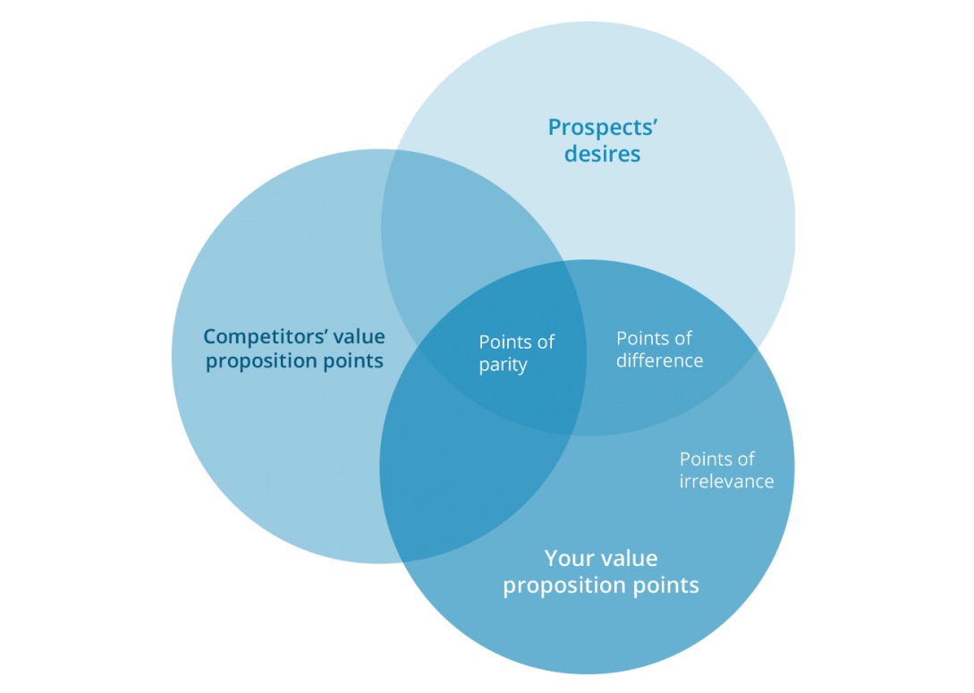
Image Credit: WiderFunnel
Have someone who isn’t familiar with your business visit your site and then ask them these questions:
- Did you know within 10 seconds or less what I offer?
- Were you confused about my offer?
- Based on what you saw, would you be interested in purchasing my product/service?
Their answers will help you grade your value proposition.
Even if you’re a big name company, you can still improve your value proposition. When The Sims 3website clarified theirs, they saw a 128% increase in game registrations.
3. Tackle objections head on
People are suspicious, and they don’t want to be sold, snookered, or tricked. They will have objections when they scope out your offer. You basically have two options when it comes to disarming suspicions and overcoming objections.
- Option One: You can try to keep piling bonuses on until they feel like they would be stupid not to get in on your offer. This is the standard, “As Seen On TV,” trick. “But wait, there’s more!” This can work but it can also generate the feeling that it’s all too good to be true. Visitors may feel like they’re getting pulled into an infomercial.
- Option Two: A better option is to address all objections head on. Speak to their fears. If you’re able to offer a really low price, explain why. If you operate in an industry with a bad reputation, speak openly about that. The more upfront you are, the less objections people will have.
One simple way to address objections is to create a Frequently Asked Questions section. This allows you to provide detailed answers to common objections and to dispel some of the suspicion.
4. Work hard to build trust
Unfortunately, the Internet is a cesspool of untrustworthy people trying to steal money from unsuspecting innocents. “Nigerian Princes”, password phishers, greeting card viruses, and a host of other villainous practices make trust a rare online commodity. If you can increase trust between you and visitors, you’ll see your conversion rate skyrocket.
How can you build that sacred trust? A number of ways.
- Have a website that looks legit. This should be glaringly obvious. If your site looks like it was designed by a moody teenager, people won’t trust you. Your site should be clean, professional, easy to read, free from typos, and without obnoxious imagery. There are plenty of comprehensive guides to teach you how to create a website by yourself, but don’t be afraid to hire someone to build an amazing site for you. Just make sure you’ve done your research, and know exactly what quality you’ll receive.
- Provide contact information. Don’t bury your email or phone number deep in the murky recesses of your site. Put your contact info in a clear, easy to find place.
- Include testimonials. The more customer testimonials you can include, the better. It shows people that you’ve worked with other customers and that you offer a real solution, not some sort of digital snake oil.
- Offer live chat. Customer trust will go through the roof when they can immediately get their questions answered. And unlike the days when you had to have a dedicated call center for live chat, there are now scores of low-cost options available.
- Offer superb guarantees. Guarantees allow people to feel safe about their purchase. It lets them know that if something goes wrong, you’ll make it right. Highlight your guarantee with a big seal to increase conversions even more. Oriental Furniture bumped up their conversion rate by 7.6% by using a guarantee seal prominently on their site.
- Use real pictures of people. Stock photos of smiling people in artificial scenarios don’t build trust. When possible, use real photos of normal people doing normal things. Medalia Art saw a 95% increase in their conversion rate simply by using pictures of actual people.
- Use videos. A simple video of you talking to customers can significantly boost your conversion rates. It puts a face on the product or service and reminds people that a real person is behind the company. This video doesn’t need to be highly produced or have a great soundtrack. Just talk honestly to your customers.
People have been burned too many times to trust just any old website. Work hard to cultivate trust and you’ll be rewarded by increasing conversion rates on your site.
Man, I feel stressed just looking at that picture.
Generally speaking, friction is anything that psychologically keeps a visitor from signing up or purchasing. Design friction is anything in the design or layout of your page that hinders visitors from moving forward. Some really easy friction points to fix are:
- Too many fields. Only require the bare minimum when it comes to filling in fields. If you only need a first name, don’t ask for first name, last name, blood type, astrological sign, and Harry Potter house. Too many fields causes fatigue, which then sends your visitors away.
- Slow loading time. If your website takes more than three seconds to load, you’re going to lose conversions. The Internet operates at warp speed, and if your website is slow, people will quickly go somewhere else.
- Too much useless text. If the pages on your site are unnecessarily long, people will get bored and go watch cute cat videos.
- Hard to read fonts. We’ve all visited sites that use a weird font. What do we do? Get out fast. Don’t get overly creative with artistic fonts and colors. Above all, your site should be easy to read.
- Too many actions. You should be driving your visitors toward a single, primary action, such as purchasing or signing up or contacting you. If you’re pushing visitors toward multiple actions, people can become confused and overwhelmed, leading to a drop in conversion rate.
More than anything else, you want your site to be smooth, attractive, and easily readable. It should be, relatively speaking, a pleasure to navigate your site. To identify friction points, A/B test variations of your pages.
6. Enough with the features already
When you’ve spent years perfecting a service or product, you can lose sight of the forrest for the trees.
Here’s the thing: most people don’t care about the finer points of your product. They don’t care that your roller skate wheels are 0.03 microns thinner than the industry average or that your carpets are triple under weaved with a double twist.
What do people care about?
Benefits. Repeat after me: It’s all about the benefits.
Visitors want to know how your product or service will make their lives better. They want to know how you will give them access to the good life. They want more comfort, less pain, more free time, more money, and fewer taxes. They don’t want endless details about how you managed to cram more processors on your motherboards. They want to know that your computers won’t crash during tax season or finals week.
When waxing eloquent about your roller skate wheels, tell them how much faster they’ll go because of the thinner wheels. Explain how the weave of your carpets creates a soft, plush, stain-resistant carpet. Paint a picture for potential customers. Help them envision how amazing their lives will be once they take what you offer.
People don’t want to buy features. They want to buy a better life.
7. The proof is in the pudding
Social proof, like case studies, are an easy yet powerful way to boost your conversion rate. After all, people want to know that you get results. That you can actually deliver. That you’re not a con man looking to make a quick buck. If you can show people the exact steps you took to help a client succeed, you’ll demonstrate that you already have a proven track record.
E-books and whitepapers are a great way to provide case studies to potential customers. You can make them longer than blog posts, and include more nitty gritty details.
8. Give your site a total makeover
If your site is so bad that a few simple tweaks won’t fix things, you may need to think about giving it a complete makeover. Yes, this will cost a bit up front. Yes, it’s going to be a total pain in the butt.
But you need to think about this in terms of long-term costs and benefits. How much will your terrible conversion rate cost you over the course of this year? Five years? This isn’t just about dollars and cents. How much further will your competition get if they have a website that is crushing it? Eventually, you’re going to be left in the dust.
Hiring a local web design team to craft you a gorgeous, conversion-centered site is a small short-term cost with a huge long-term benefit. Don’t settle for lousy conversion rates when you don’t have to.
Wrap
Many people assume that low conversion rates are the result of a poor product or service. Thankfully, that isn’t true. By implementing all or some of the steps listed above, you can fix your problem.
Here’s to more conversions!
Article originally published on Jeff Bullas
RELATED ARTICLES

4 POWERFUL SEO STRATEGIES FOR ONLINE RETAILERS
Focus on long-tail terms where you’ll face less competition and…

4 GOLDEN RULES OF BLOG-POST ENGAGEMENT YOU NEED TO KNOW
The single most important thing to measure for every blog post…

6 QUICK-AND-DIRTY WAYS TO BEAT WRITER’S BLOCK
Don’t publish less often. Instead, learn how to beat writer’s block…